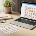
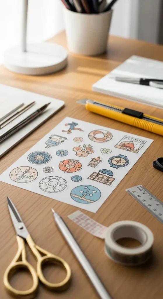
Great printable stickers don’t happen by accident. The difference between “homemade” and “store-quality” usually comes down to a few design decisions — resolution, spacing, color setup, and layout.
The good news: you don’t need advanced design training. Once you understand the core principles, your stickers instantly look cleaner, sharper, and more polished.
Below is a simple guide that breaks down how to design printable stickers that feel professional from the start.
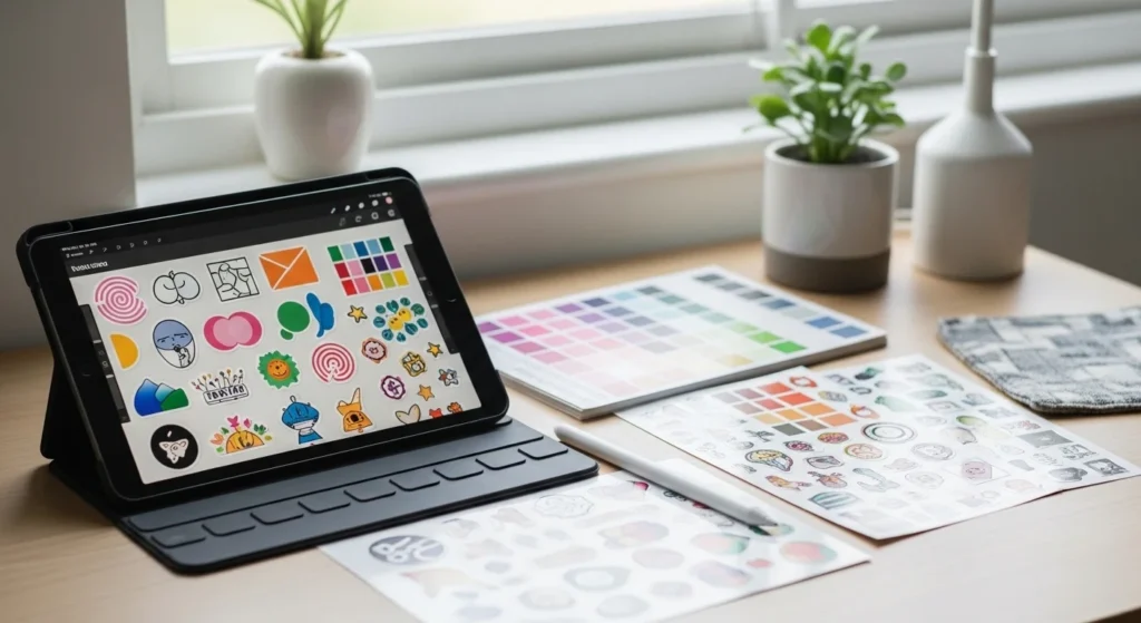
Start With Vector When Possible
Professional stickers stay crisp at any size. That’s why many designers use vector graphics.
Vectors don’t pixelate when resized. This matters for small stickers, icons, and text.
Beginner-friendly vector tools:
- Illustrator
- Inkscape (free)
- Canva (basic vector shapes)
If you draw on tablet apps, you can convert artwork into vector later.
When raster images are used (PNG, JPG), make sure resolution is high from the start.
Quick rule:
- Icons → vector preferred
- Hand-drawn art → high-resolution raster is fine
This one decision alone improves sticker quality dramatically.
Use the Right Resolution (300 DPI)
Resolution determines print sharpness. Low resolution creates blurry stickers — especially noticeable on small designs.
Standard rule:
- 300 DPI minimum
Before exporting your file:
- Check canvas size
- Confirm DPI is set to 300
- Avoid enlarging low-quality images
Create designs slightly larger than final size. This gives flexibility when exporting.
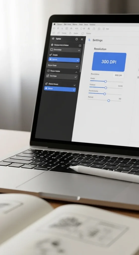
Think of DPI as your safety net for sharp prints.
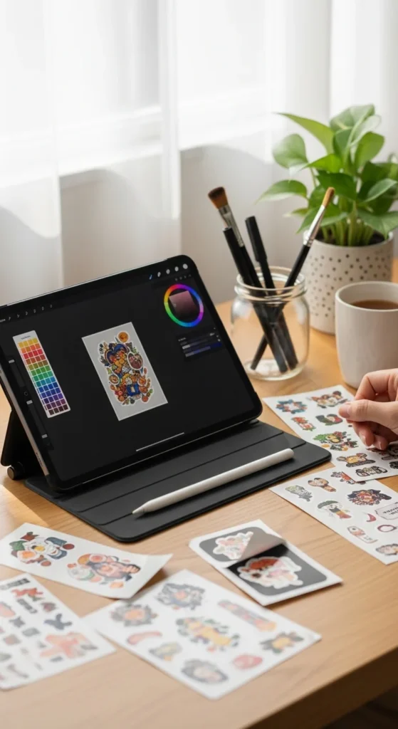
Set Colors for Print (CMYK Awareness)
One of the biggest beginner frustrations is color mismatch.
What you see on screen (RGB) often looks different when printed. Professional workflows prepare for this early.
Simple approach:
- Design in RGB for flexibility
- Test print
- Adjust colors slightly darker or more saturated
- Convert to CMYK for final export if needed
Helpful tip:
Bright neon colors often print softer. Slight contrast adjustments help.
Color test sheets save time and materials later.
Use White Outlines (Border Magic)
White outlines instantly make stickers look professional.
They help designs stand out on dark backgrounds and improve cutting accuracy.
Basic guideline:
- Add 2–3 pt white stroke around the sticker shape
White borders also hide small cutting imperfections.
Best uses:
- Character stickers
- Text stickers
- Busy illustrations
- Die-cut shapes
If your stickers look “flat,” adding a border often fixes it immediately.
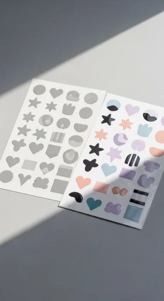
Keep Layout Simple (Less Is More)
Many beginner sticker sheets fail because they feel crowded.
Professional sticker sheets usually have:
- One main theme
- 1–2 focal elements per sticker
- Consistent spacing
- Clear visual hierarchy
Simple layouts print better and cut cleaner.
Layout tips:
- Leave 0.1–0.2 inch spacing between stickers
- Use repeating styles
- Stick to one palette per sheet
Minimal designs often sell better because they feel versatile.
Understand Bleed and Safe Zones
Print design uses invisible margins to prevent trimming mistakes.
Two important areas:
Bleed
- Background extends beyond cut line
- Standard: ~0.125 inch
Safe zone
- Keep text and important details inside
- Standard: ~0.25 inch from edge
Without these, stickers can look slightly off after cutting.
Beginners often skip this step — professionals never do.
Organize Layers Like a Pro
Layer organization saves time and prevents mistakes.
Simple structure:
- Background
- Artwork
- Text
- Effects
- Cut line
Group related elements together. Name layers clearly.
This makes editing faster and avoids exporting errors.
Good layer habits matter more as your sticker designs grow.
Choose Finishes That Match Your Style
Finish affects how colors appear and how stickers feel.
Common options:
- Matte → soft look, fewer fingerprints
- Glossy → brighter colors
- Laminated → water resistant
- Specialty papers → holographic, shimmer
Test prints help you decide which finish works best for your design style.
Professional designers often test multiple finishes before releasing a product.
Proof at Actual Size Before Export
Zooming in is helpful — but always check designs at real size.
Proof checklist:
- Zoom to 100%
- Check text readability
- Look for thin lines
- Confirm spacing
- Print one test sheet
Many design mistakes only appear at real scale.
This step prevents wasted paper and reprints.
Use Mockups to Make Designs Look Real
Mockups help visualize finished stickers before printing or selling.
Simple mockup ideas:
- Laptop placement
- Water bottle scene
- Planner spread
- Packaging preview
- Sticker sheet flat lay
Mockups also help with marketing visuals.
They make designs feel finished and intentional.
Final Thoughts
Professional printable stickers come from small decisions done consistently — resolution, spacing, color awareness, and clean layout.
You don’t need complex software. You need a repeatable workflow.
Start simple:
- Use high resolution
- Add white outlines
- Keep layouts clean
- Test print every time
Your designs improve quickly once these habits become routine.
Save this guide for later and use it the next time you create a sticker sheet. ✨